USCIS - Citizenship Resource Center
Helping aspiring U.S. immigrants navigate complex government information.
Timeline
September - December 2024
Team
Anjana, Ming-Han, Parth, Jonathan
Role
Product Designer
Tools
Figma, Screaming Frog, Card Sorting, Excel
LONG STORY SHORT
I restructured the information hierarchy to better align content with users’ mental models and needs.
This project was a collaboration between my Information Architecture course and USCIS (United States Citizenship and Immigration Services). The focus was on redesigning the website’s structure to support key audiences, such as immigrants, educators, and related organizations, who rely on clear, trustworthy information to complete tasks.
Some notable accomplishments:

PROBLEM
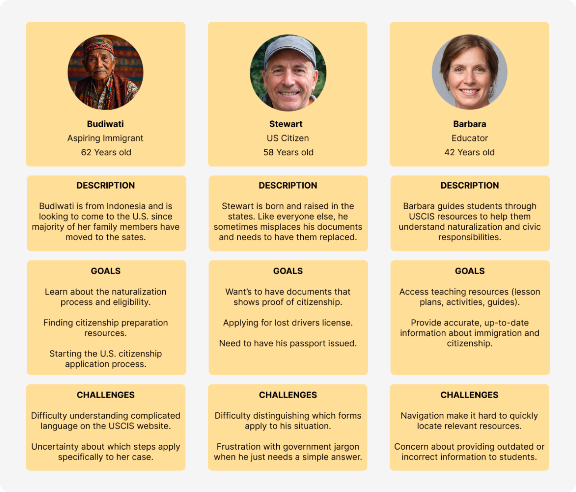
Aspiring U.S. immigrants find it challenging to search for specific information on the USCIS website, leading to frustrating experiences.
At the beginning of the semester, we were provided with a spreadsheet by Hope Turner, the Design System Program Manager at USCIS, which contains customer feedback reports from the years 2023 and 2024.
Analysis of USCIS customer feedback from 2023–2024 revealed a consistent pattern of users struggling to locate specific, task-relevant information.
Among all topics, citizenship, certificates, and naturalization were among the most frequently referenced, indicating high demand alongside persistent confusion.

🗣️ How can we reduce frustration for aspiring U.S. immigrants when searching for information on the USCIS website?
INITIAL RESEARCH
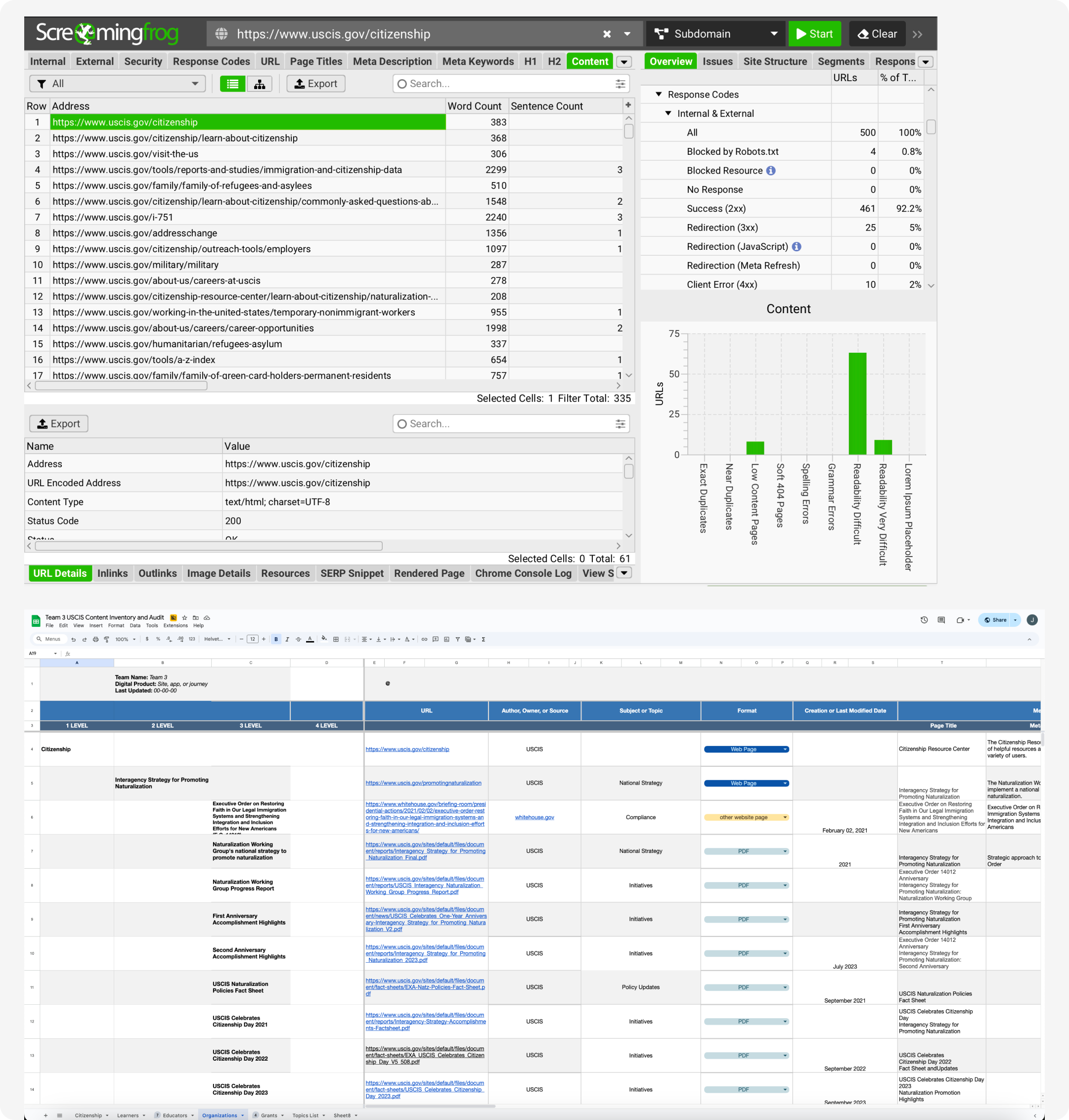
We conducted a content inventory and audit on 7 of USCIS webpages.
We utilized a software called Screaming Frog, which automatically crawls the website to collect metadata. The collected data is then exported into a spreadsheet for analysis. Through this audit, I found:
1. Outdated and duplicate web content.
2. Pages that are high and low in priority.
3. Broken links and dead-end pages.
USER MENTAL MODELS
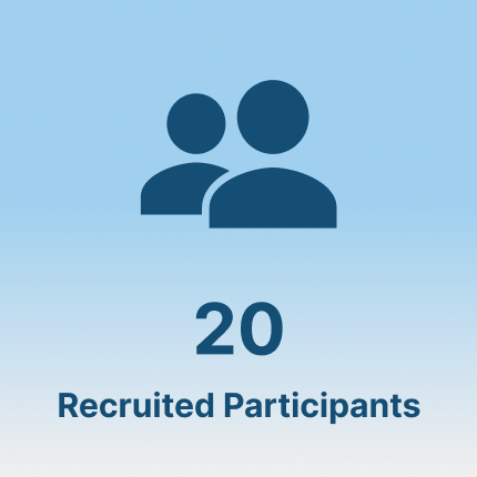
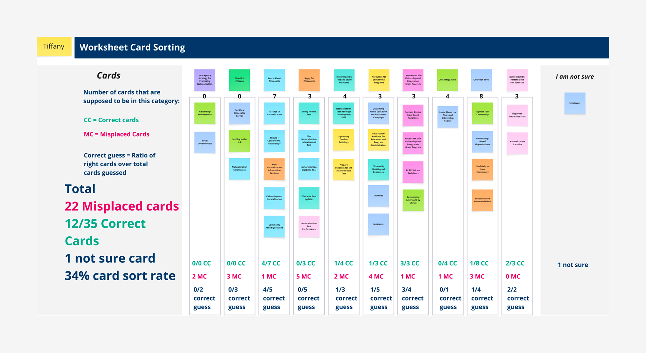
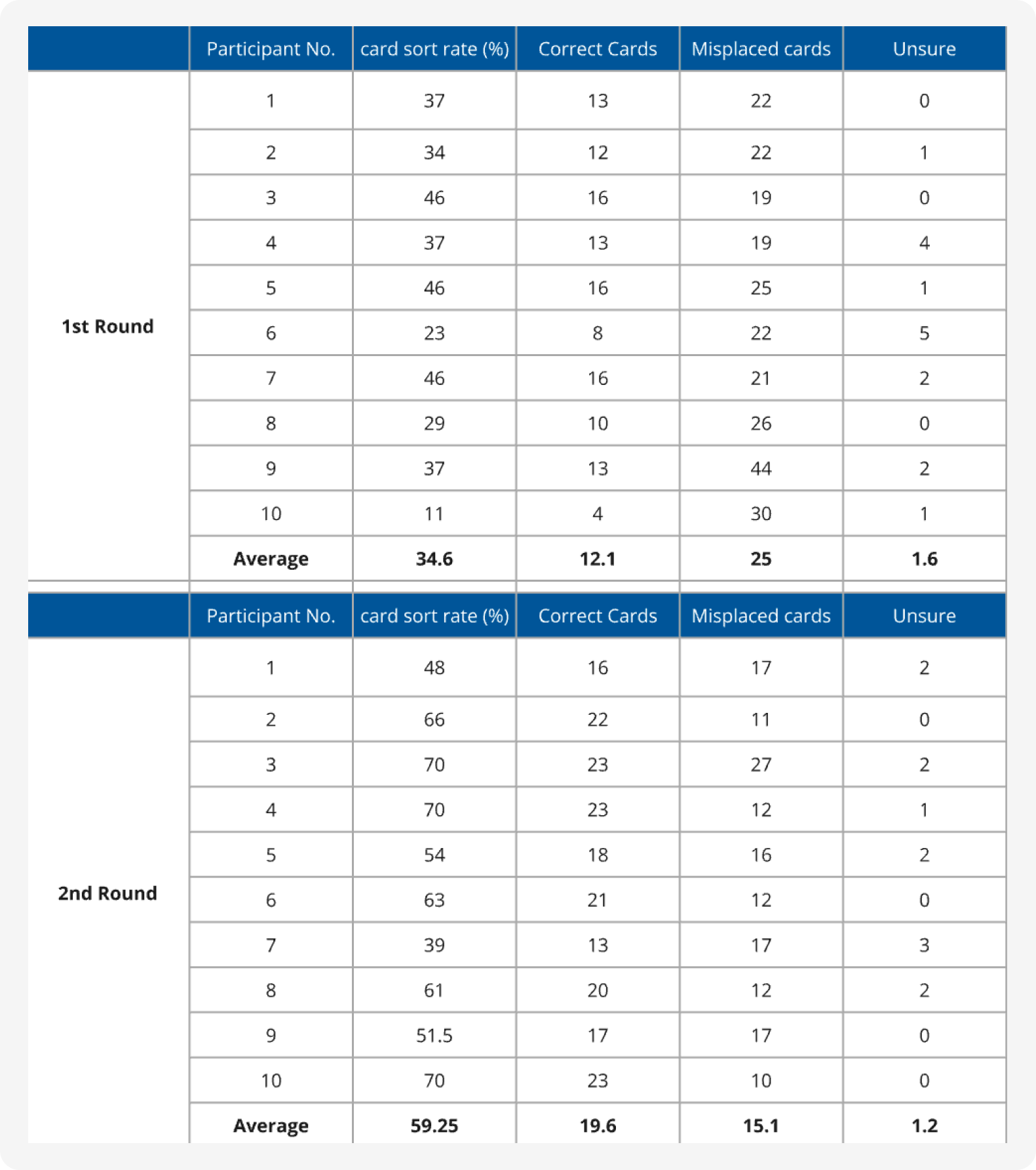
We conducted a closed card sort study with 10 participants.
The card sorting exercise helped us understand how users’ mental models differ from those of the designers who originally built the site. In addition, we asked participants to think aloud during the exercise to understand the reasoning behind their actions.
The average correct card placement rate is 34.6%, with the lowest being 11% and the highest 46%.
After thorough analysis of the data we collected through the first round of testing, here’s what we found:
INSIGHTS AND OPPORTUNITIES
OUTCOME
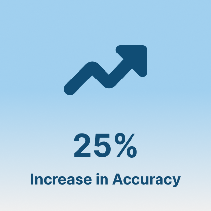
Once the naming changes were in place, we conducted a second test.
With the help of a new set of 10 participants, we asked them to sort the cards into the categories they believed contained the information.
Success Card Sort Rate
34.6% → 59.25%
The success rate of placing a card in the correct category went up by 25%. In addition, the number of “unsure” cards also declined.
WEB DESIGN RECCOMENDATIONS
🔑
Keyword Organization
Cards with similar wording were grouped together, even if they served different purposes.
Unclear topic wording was the primary source of user confusion.
😵💫
Ambiguous Categories
Categories that were vague or related, lead to duplicate card placements.
📖
Unfamiliar Jargon
Government terminology and a lack of context made it difficult to understand various terms.
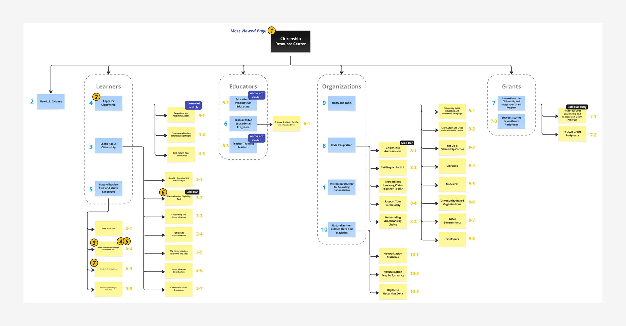
I created a sitemap of the sites initial structure before meeting with the group to discuss lay out changes. We also changed name of many cards to make it easier to understand.
🧠
Personal Logic
When labels were unclear, users relied on personal expectations.
Multi-level Accordion Navigation
Increase the white space between sections to improve hierarchy. Create categories that group content for their intended target audience.
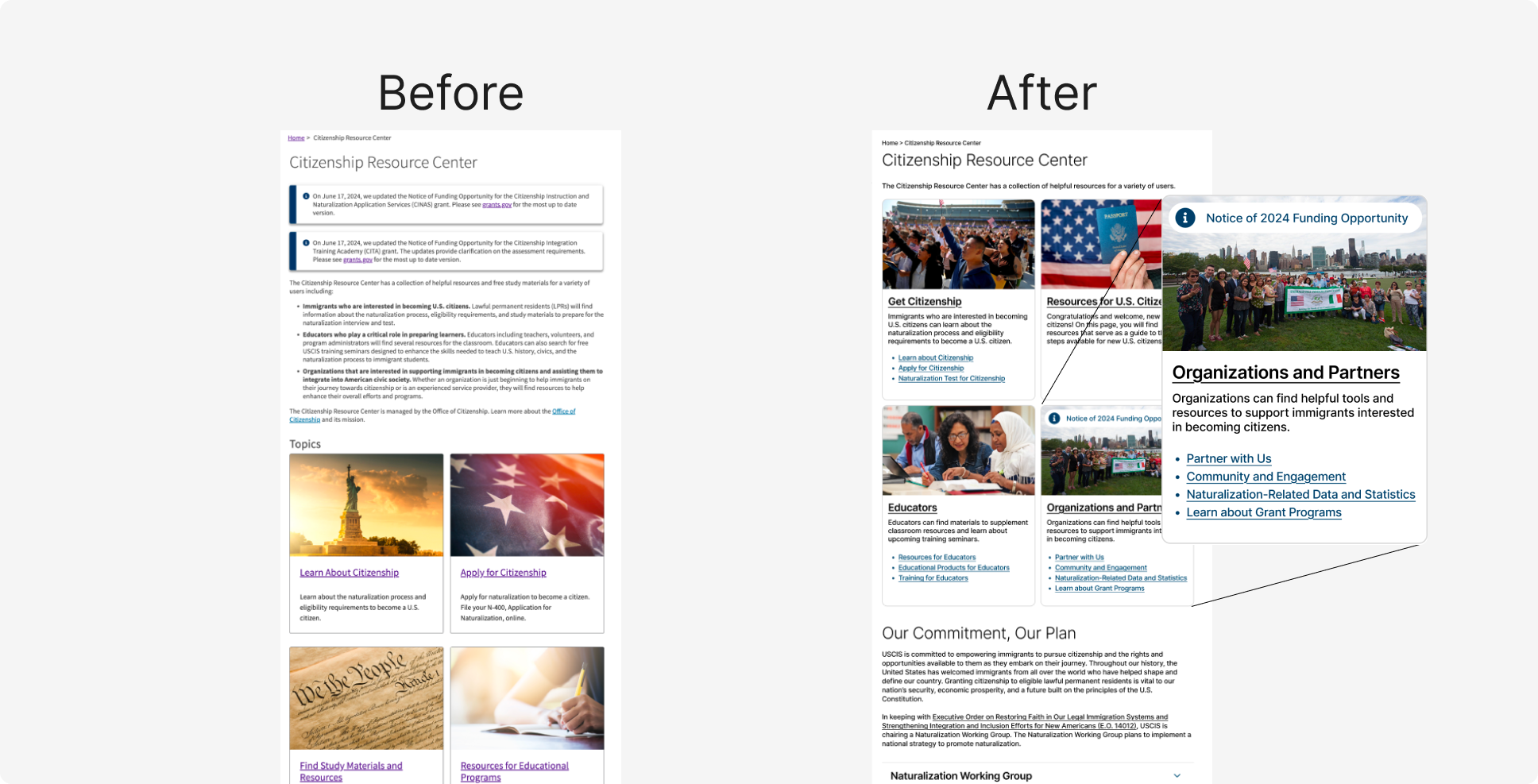
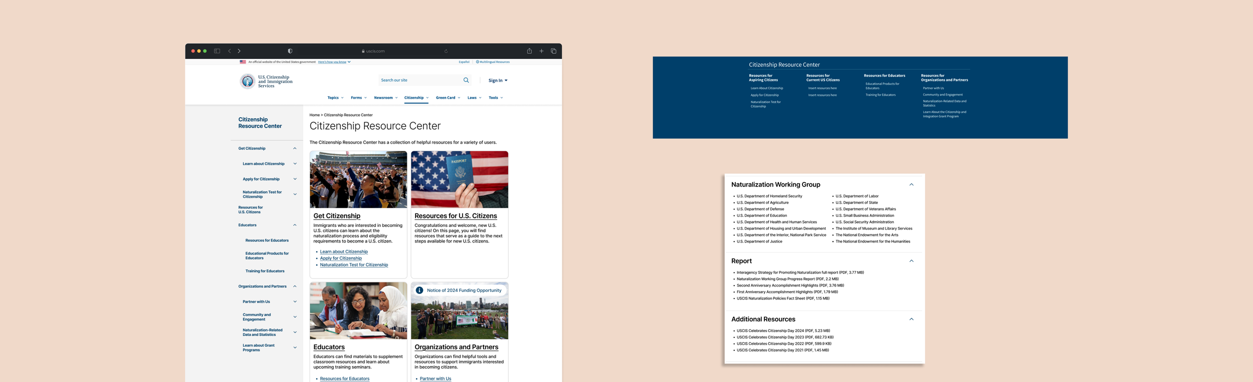
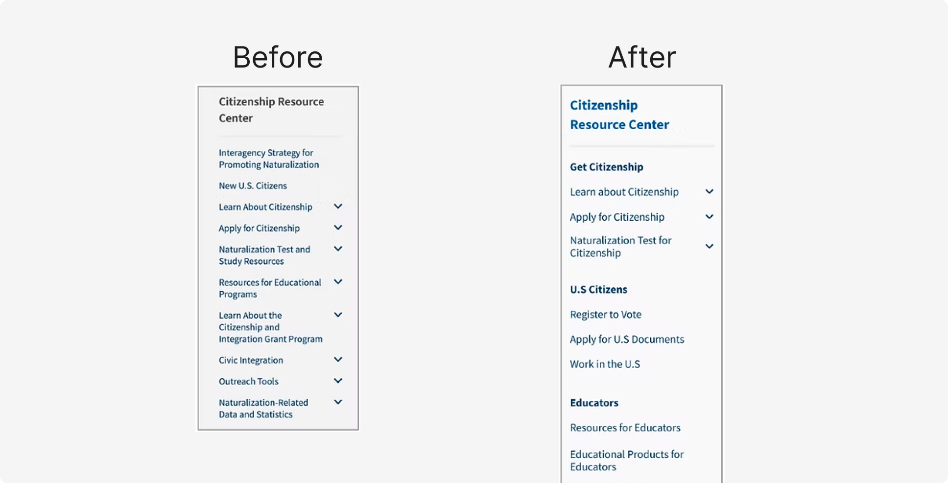
Citizenship Resource Center
Imbedding latest news in their respective sections. In addition, we grouped resources with their respective audiences.
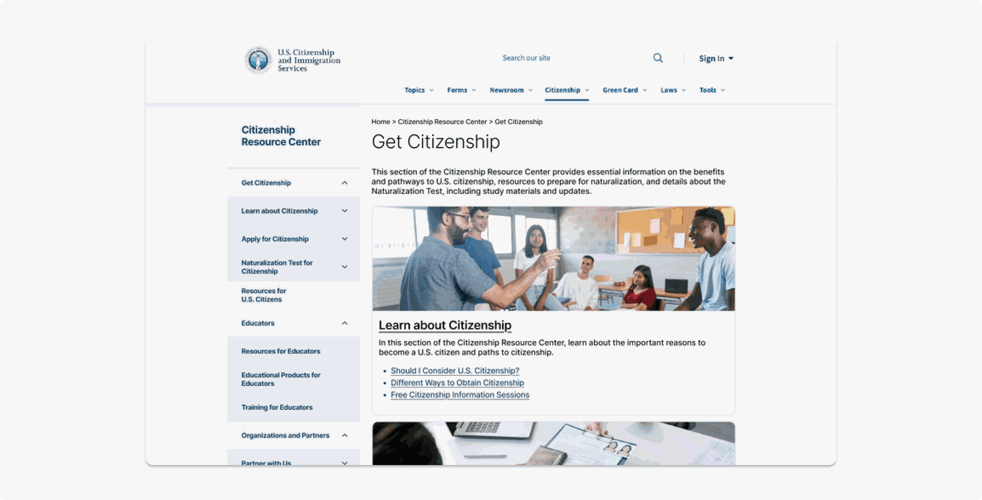
Get Citizenship Page
Houses all the information on obtaining citizenship to help users browse quickly.
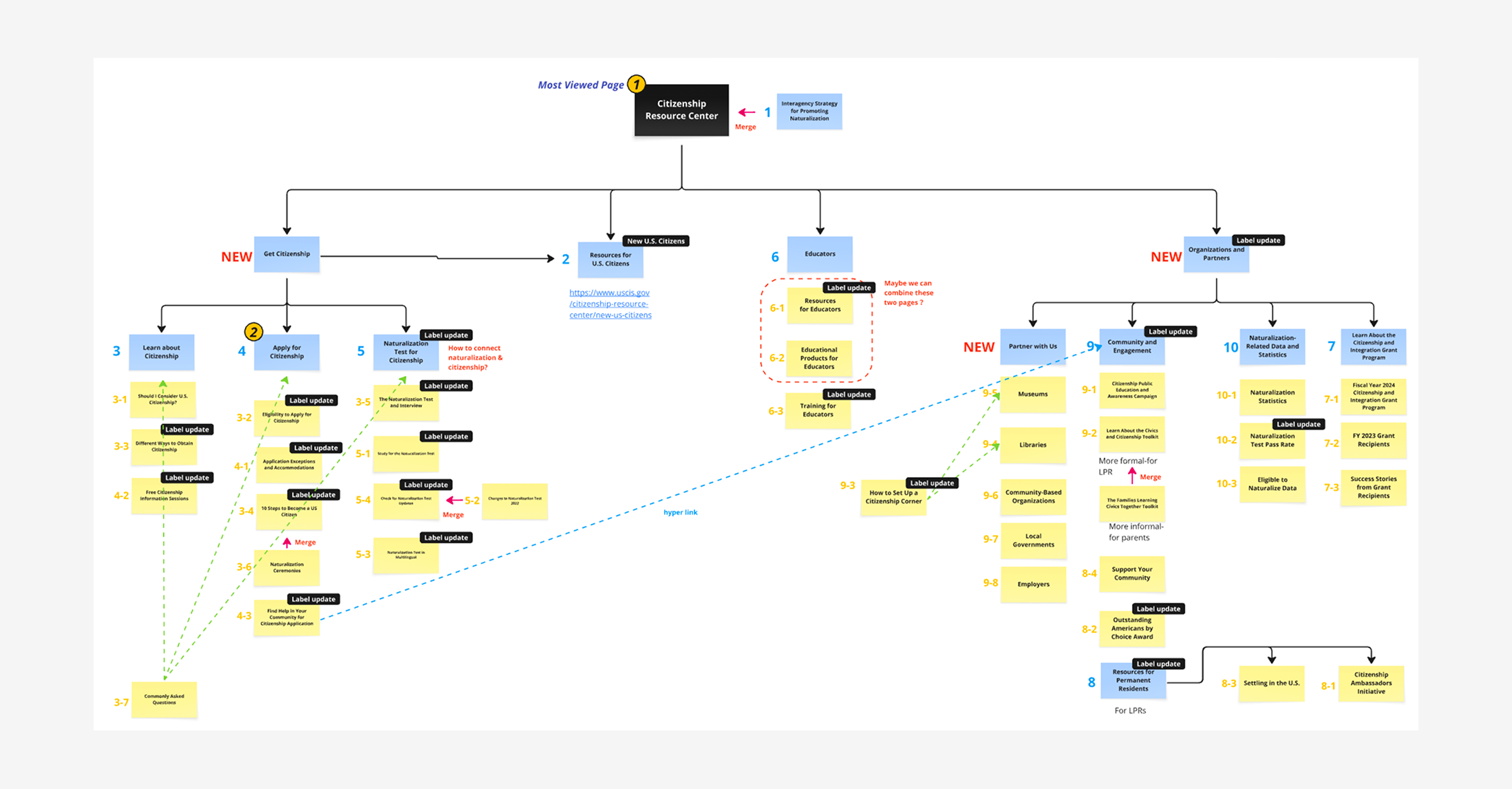
Updated sitemap with changes
Initial USCIS sitemap